
Volunteer Mobile App (Student Project)
Volunteering made fun...
Our student design team was tasked with creating a mobile application that encouraged and promoted active volunteer activities through the concept of gamification. This concept is built anround the concept of "micro-volunteering", a small good deed that takes two minutes out of the volunteer's time, but adds to the completion of a larger scale project. An example we were given was documenting the public buildings that had an accessible handicap ramp. Someone documenting this can help another push the motions to get more ramps where people need them.
The idea is that volunteer would build up the community around them while building up their virtual cities within the app. The brief required we make high fidelity screens and prototypes that showcased this gamification element, and a design system for a later team to build upon as the app grows.
This is Jessica, our "Active Volunteer"
- * 20 years old
- * University student
- * Volunteers regularly
- * Often fees underutilized
- * Not enough opportunities within her open time frames between classes and work schedules

Jessica is a very active individual, and that activity prevents her from volunteering in a larger capacity. There are not enough reputable projects she can complete in the time between classes and work. We set out to not only create a product that would provide that service to her, but also an interface that woukld make her aware of what her time is going towards, to allow her to see the impact in real-time with her virtual city.
Principles to follow
These principles were provided to us by our UX handoff. These were the main targets to reach for when we started making decisions. The final solution needed to:
Simplify
Cut through the noise, curate the experience.
Catalyze
Spark an interest and habit.
Retain
Keeps users engaged and coming back for more.
With those initial UX deliverables, we recieved a presentation deck that broke down their major findings in their process. The key page of the presentation was the section titled "What Didn't Work". It names off three key areas that users and the designers found problems with when the project concluded.
Areas to recognize...
“Onboarding tutorial should be accessible at all times.„
The onboarding section proved to be a struggle for us as well as we moved into our own version of testing. Here the UX team states it was because the instructions were not being retained by the users and they needed to call on that information later on in their journey.
“Copy (particular instructions for activity) should answer the questions how and why and nothing more.„
There were many discrepancies with the chosen copy, as we also realized in our own investigations. The chosen vernacular was hard to decipher, not clear for users to understand, and tripped up the overall experience.
“No tangible rewards (e.g. progress bar or points) beyond growth of city.„
The lack of rewards was something that we immediately noticed upon dissecting the brief. We did not know what functionality the UX intended for the rewards or any of the gamification elements for that matter. The wireframes were more focused on the functionality of the app overall.
Gamification as a trend...
It was difficult to find “competitors” to study in this kind of space. One, because of the intention of the product, “competitors” was just not the right word to describe them. Another reason was that this app was truly unique as no one was trying to do the exact same thing. So for direct “competitors”, we focused on apps that offered to connect volunteers to activities. As for indirect, we chose to study apps that used gamification to form positive habits.
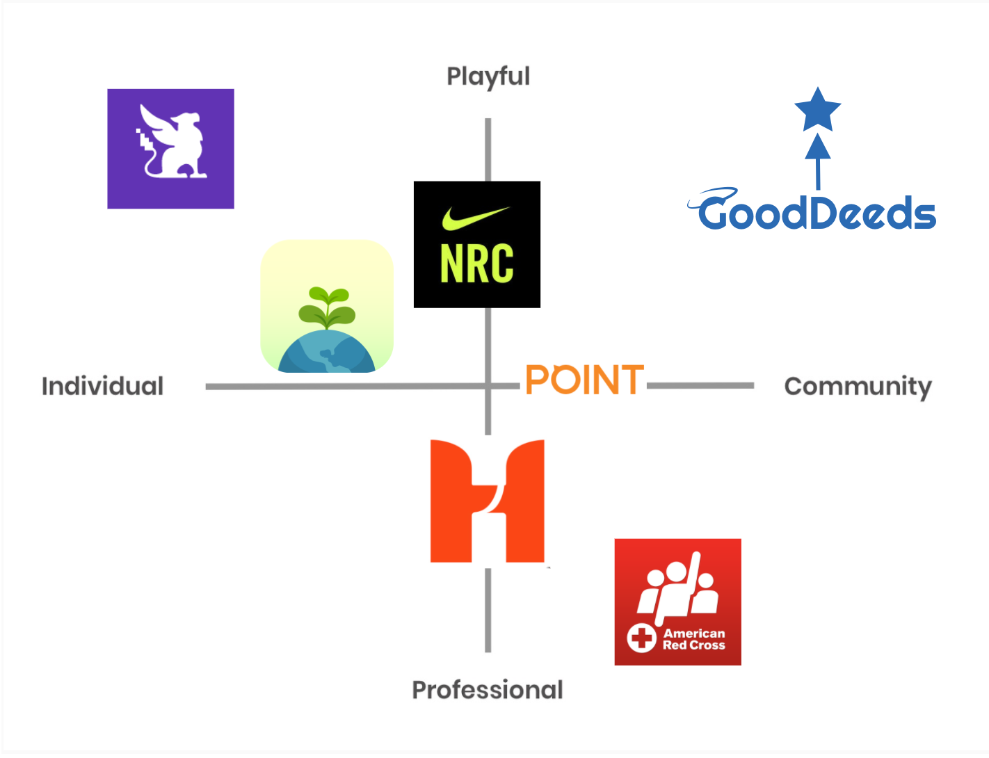
"Priority Matrix" exercise but with Brand Values as the axises
As we suspected, there was a large gap in the market for an app about community that evoked a playful brand. It was the perfect target space for GoodDeeds to fill.
So, How Do We...
Create an interface that is both engaging and reputable?
Make something easy for users to learn and come back to?
Build UI elements that are enticing, impactful, and instructive?
Diverging Ideas...
With a design principle like "simplify", my immediate thought was a light, white interface. And it was tough to be divergent with that initial thought in my head. But I attempted to expand my thoughs, really trying to capture "light" in different ways. "Light" was something that also kept creeping into my mind, with the thought of a "radiant smile"
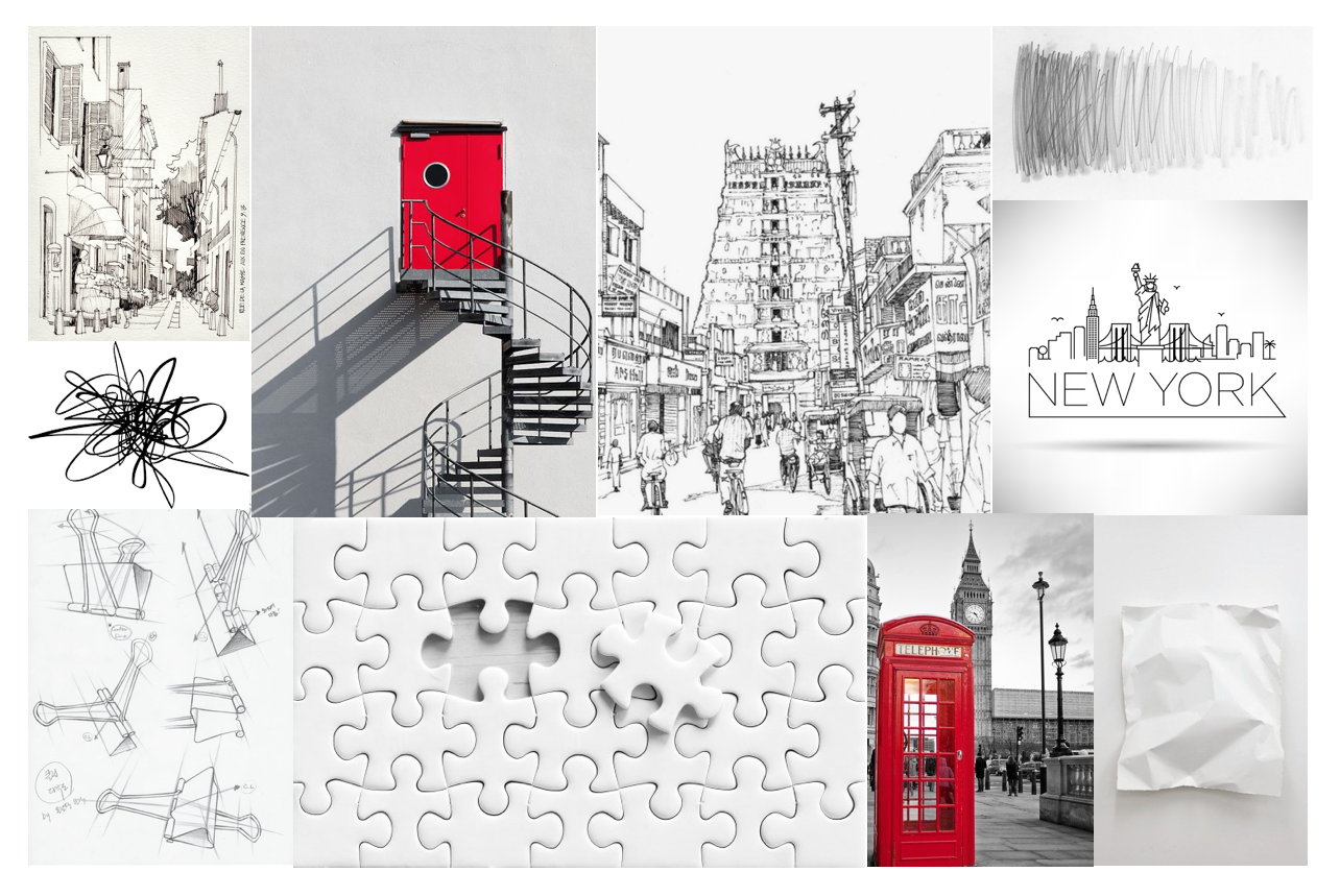
“Coloring in Red”
- * Goal: Capture that “impact” that Jessica is craving.
- * "Coloring in your city" was an interesting notion to possibly explore.
- * However, the interface without the coloring is just blank, and that might be unwelcomed.
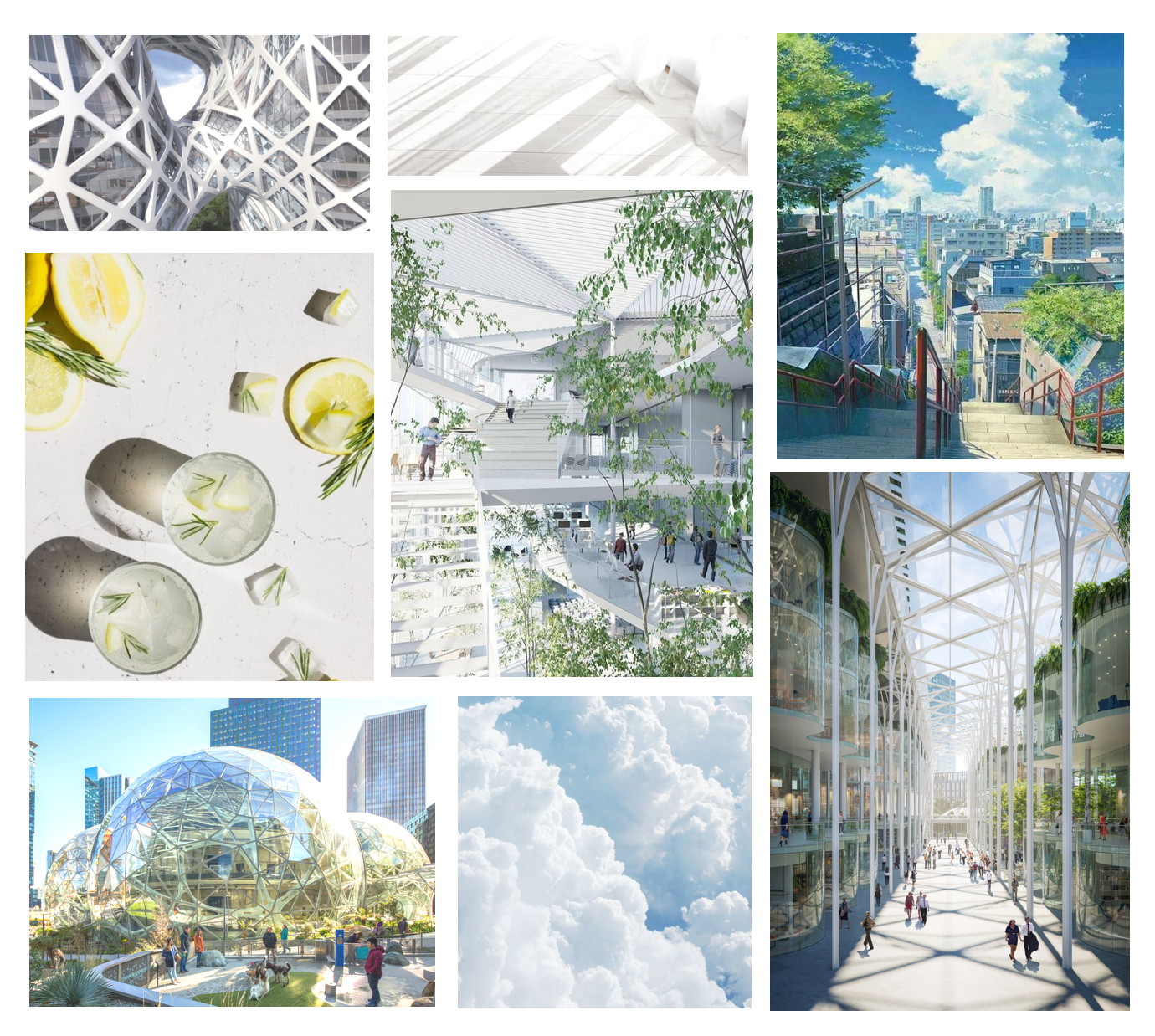
“Breath of Fresh Air”
- * Goal: capture that feeling of freshness and relief.
- * Very successful representation of that concept for users and peers.
- * Color scheme is uniform and very clean.
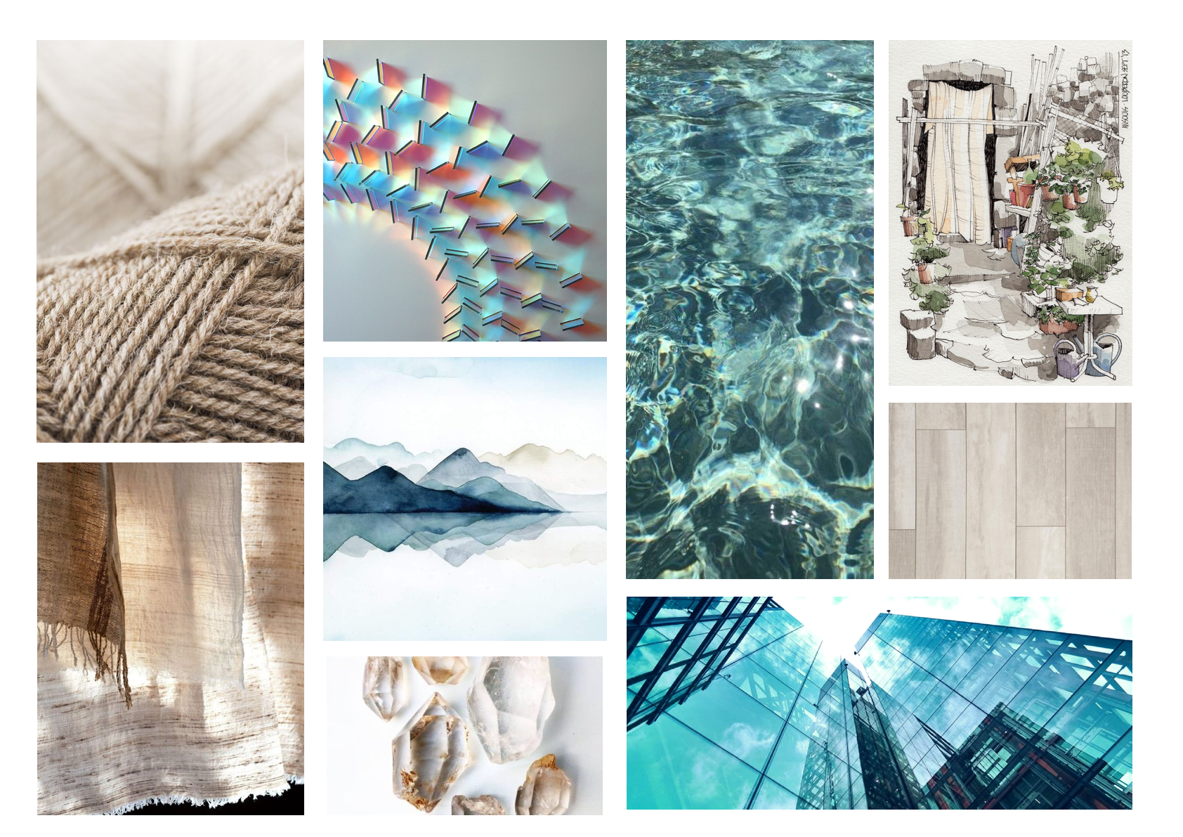
“Reflective”
- * Goal: Capture the transparency of light on the glass; a good deed is something good to "reflect upon"
- * Many water associations instead of glass, not the same effect.
- * Not a cohesive feeling, or at least as strong as the other two examples.
Converging Ideas...
I focused mainly on the "Breath of Fresh Air" mood for this particular tile. I expanded on the colors and tried to experiment with a monochromatic palette since I personally have never tried one before. Here are a few takeaways:
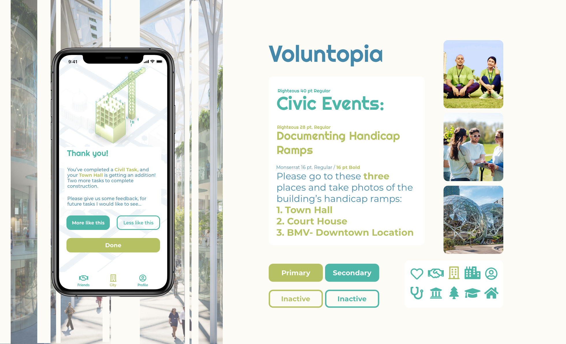
- * The typeface (Righteous) is very unique and fitting.
- * Teal color is very "fun".
- * The overall tile clearly conveys the product and brand to viewers.
- * The monochromatic is not as "punchy" or "impactful" as the red iteration.
- * The green is not as favorable shade.
- * Too many associations with environmental work (pigeon-holing).
As the project progressed, our focuses were excited to dig into the gamification elements. And since we were starting from scratch on those features, it felt like a high priority internally. But in reality, the features were important to test and the graphics were simply "nice to have" at this stage. For myself, I chose to rearrange my priorities; I would focu on the functionality and sacrifice the graphics for the time being. This break down helped reorient the project for me.
First, focus on Functionality...
So how did I...
Create an interface that is both engaging and reputable?
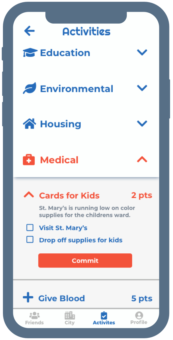
- * Primary colors were the main component of this goal. While some users may find them "dull" and not as vibrant or exhilarating to look at, the app is still an accessible tool for all types of users. It needs to have an air of seriousness for people to believe in its legitimacy. In contrast, some of my team took the exhilarating colors for their approaches, and users associated those interfaces with words like "juvenile" and "kid-friendly". In contrast, I took another approach to test the variable changes.
- * The events pages also needed to be void of distraction, so I took the design back to basics. The cleanliness was to enforce quick access and an in-out user journey. This page was not meant to be studied in great detail.
Make something easy for users to learn and come back to?
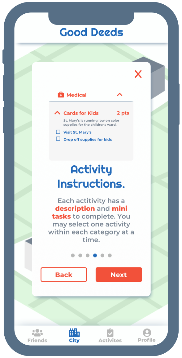
- * As discussed in the UX briefing, the main problem with users learning is the lengthy instructions at the start of the user journey. I attempted to make this process as skimmable as possible, pointing out key phrases and points with extra emphasis. Users were still having trouble retaining all the features of the app, but not so much how to engage with them as alluded to in the UX process.
Build UI elements that are enticing, impactful and instructive?
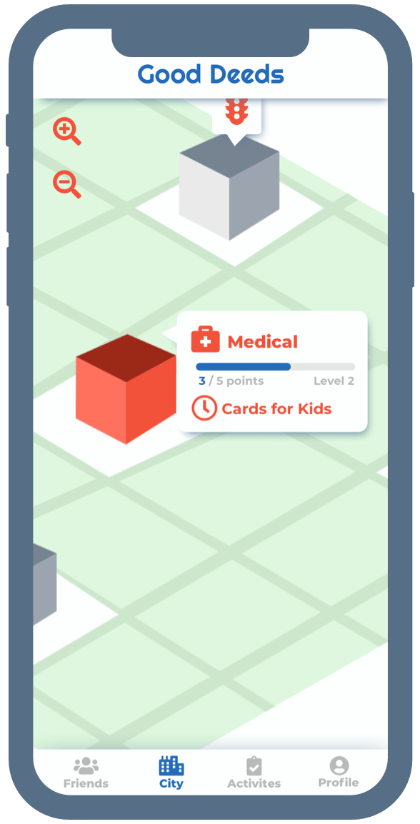
- * It was important to have a friendly and approachable interface for this type of product. I focused on rounded edges and floating elements within the UI space. Pop-ups were meant to really sit between the plane and the screen. Icons were meant to be vibrant and large. I also introduced progress bars and a few animations to really enhance the impactfulness of every interaction.
Second, focus on gamification...
I felt confident about the functionality for a first time user with about a week to spare in the month-long sprint. I spent that time trying to envision the graphical brand for GoodDeeds as a whole, and it proved a trying task for one person in that short amount of time in between usability tests. So I had to compromise. I elevated the original place holder boxes, but only by one “level”. I had originally envisioned several levels a building would undergo to make the city “grow”.
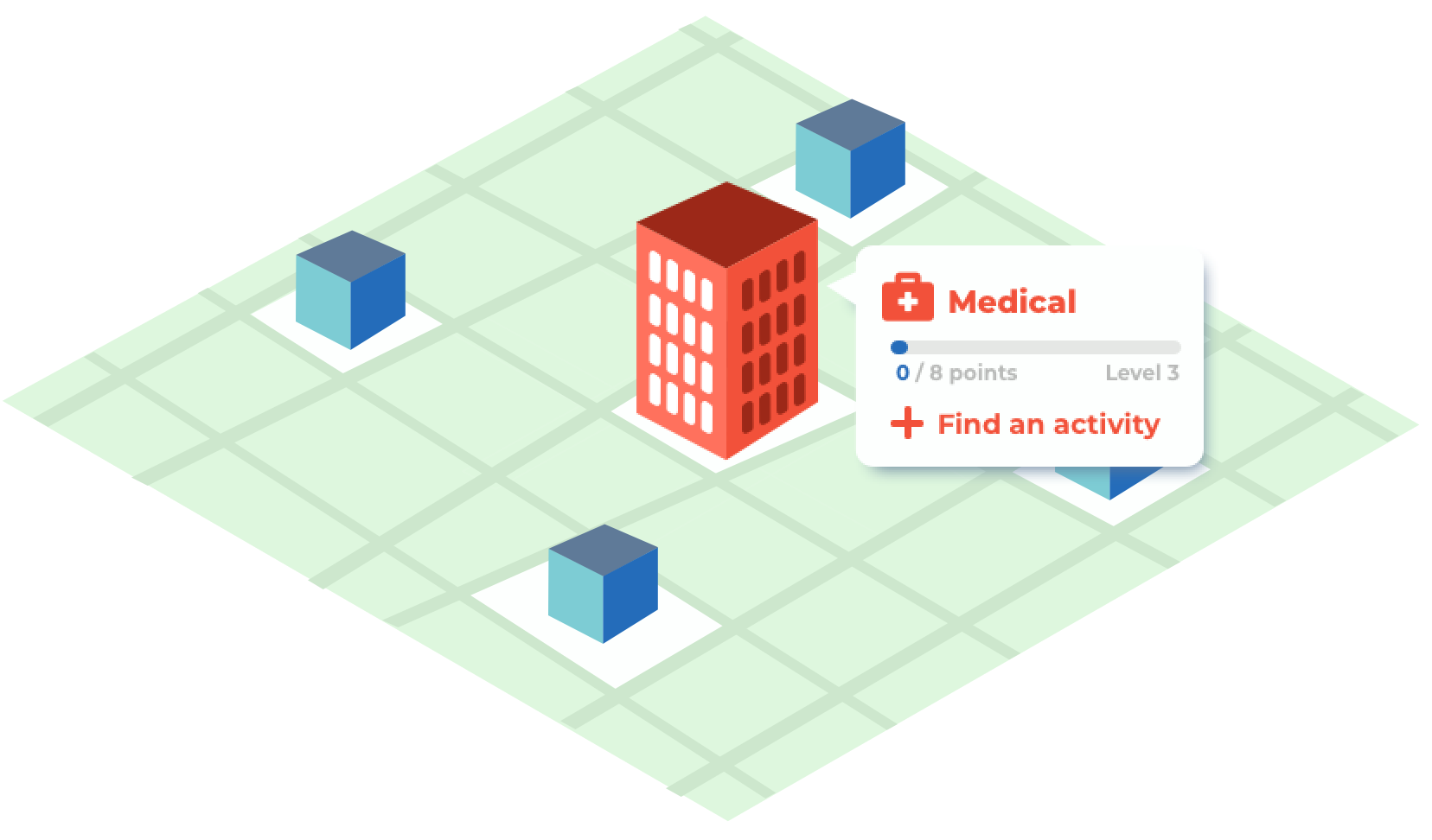
The final solution...
Feedback from users...
Feeback was a constant part of this design sprint. We had three different rounds at the end of each week and iterative stage. At the end of the project, we did one last test that was a mix of desirability and usability. Each of our designs was placed in front of our users. And even though we did not converge on one design as a team, it was hard for users not to compare between them. In terms of actionable feedback, these are some key takeaways;
“It looks so simple that I can navigate it. I don't feel overwhelmed popping back into it.„
- * Navigation is easy and simple
- * Organized and professional word associations
- * Clean/Concise and Readable
- * Colors might be too "dull"
- * Could be more encouraging (introduce some confirmation screens with more excitement).
Many future recommendations...
As many problems began to reach out of scope, we had to narrow our priorities to the brief at hand. But we noted a few things we would have liked to tackle next;
1. A new onboarding flow...
As the UX team noticed in their own process, the onboarding flow was a pain point for testees. But where their solution was to make the onboarding always accessible, we found something else. The onboarding was the issue itself, because it was instructive, but did not elevate retention of those instructions. We suggested a live onboarding process, where the app takes the user through the motions and makes them learn how the features work, not simply just remember them.
2. Gamification as a single sprint...
Since we had no gamification features to build off of from the cold handoff, each designer approached gamification in a different way. This lead to many discoveries when testing the iterations side-by-side with users as we did. We suggested an entire sprint dedicated to this important aspect of the app since it required further optimization.
3. Graphics focused on branding...
Many associations were gathered for each of our designs. For mine, people saw similarities with the Sims primarily. The graphics alone can speak volumes for a product like this, like Minecraft and Animal Crossing have their own signature looks. For this kind of success, we would require more focus on the graphics specifically, maybe even going so far as to hire or assign a graphic designer to the task.
Translating this styleguide...
The style guide was very focused on spacing and assets. So there were a lot of grid guidelines to consider. A lot of that was to make the app highly accessible for anyone to use. The colors and typefaces had to be legible and clear, which is why the final iteration was primary in theme. The guide looked really small in retrospect, but it has a lot of repeated elements in various scenarios throughout the app.
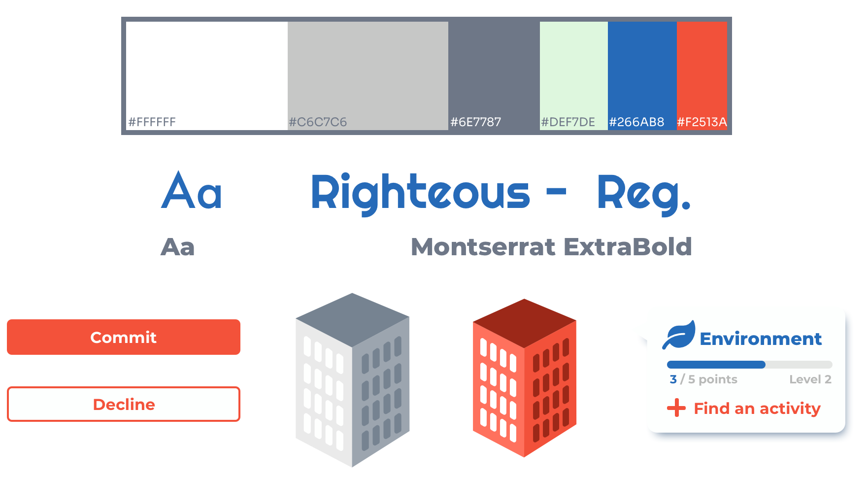
GoodDeeds was a very challenging app, due to its shockingly large scope, a troubling UX cycle, and Covid-19 preventing proper research. But in those challenges, I was able to find opportunities. I learned a lot about priority management for a project and reflecting on the brief as a source of truth. These were key skills to learn before being placed before a client, which was the task ahead of us in our coursework. Even with its pain points, GoodDeeds remains a highly influential project in my young career.
Thanks for reading!
