Estase Planning Web Application (Client Work)
“Functional but void of brand...”
Life Snapshot is a cloud service meant to store documents surrounding the customer’s estate. In the event something were to happen to the customer, those documents would be shared with the intended recipients they designated at the start of the process. The client created a product they felt was missing in the market, a service that was organized but also human at its core. Our task was to reflect that brand of Life Snapshot in that web application portal for that customer.
The brief was very open-ended in terms of expectations and the client made it transparent that they were flexible to any ideas, from interface to functionality. The only thing they specified was the color scheme they were striving to stay loyal to and a few key screens they would like us primarily focus on. However, I found the most important aspect of the brief was the list of brand attributes they included;
With only a month to complete this project, these values quickly became my foundation. I began researching how to make these six words into visual concepts. I wrote them large in my notebook and diligently kept looking back at my thoughts and notes surrounding them for my entire process.
For this project, I was placed in a group with two other designers as this was a student project within our Flatiron curriculum. However, it was always the expectation between our group and the client that each designer would produce their own individual designs for the final product. So design work was to be done independently, but client meetings were to be delivered as a group.
For my approach, I formed the following questions as my main scopes and goals to complete within the month ahead;
So, how do I...
Elevate the current brand attributes and values?
Add that missing human element the client wants?
Without getting distracted with major UX changes?
Creating a Mood...
About a week in, I took the quotes and phrases collected from our client and tried to visualize the concepts into moods. In terms of color schemes, I chose to remian loyal to “grey and blue” but in varying degrees for each board. This was to test that “flexibility” the client stated at the beginning of our task. I placed my ideas in front of users at the end of that week to gauge the appeal of the moods overall and the association of that mood with estate planning. Some of my main findings are as follows;
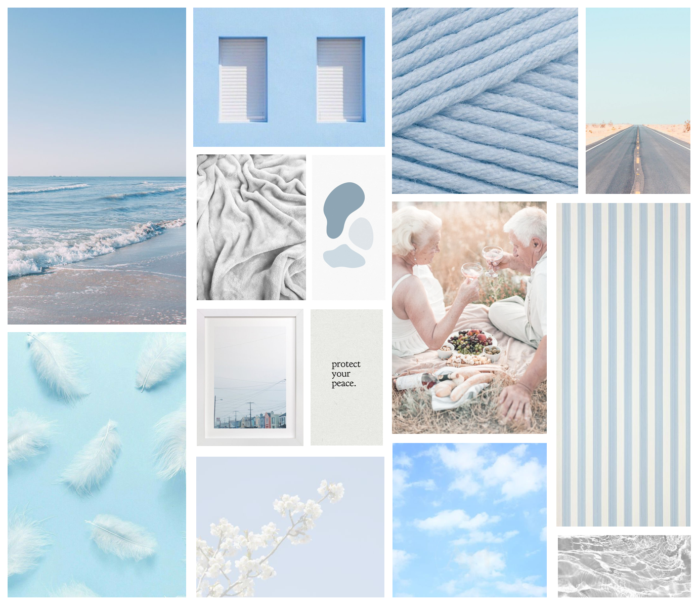
“Peace of Mind”
- * Words users chose: Calm and Peaceful
- * Many users were discouraged by the thoughts of old age and retirement.
- * Fit in with the theme of estate planning but not desirable.
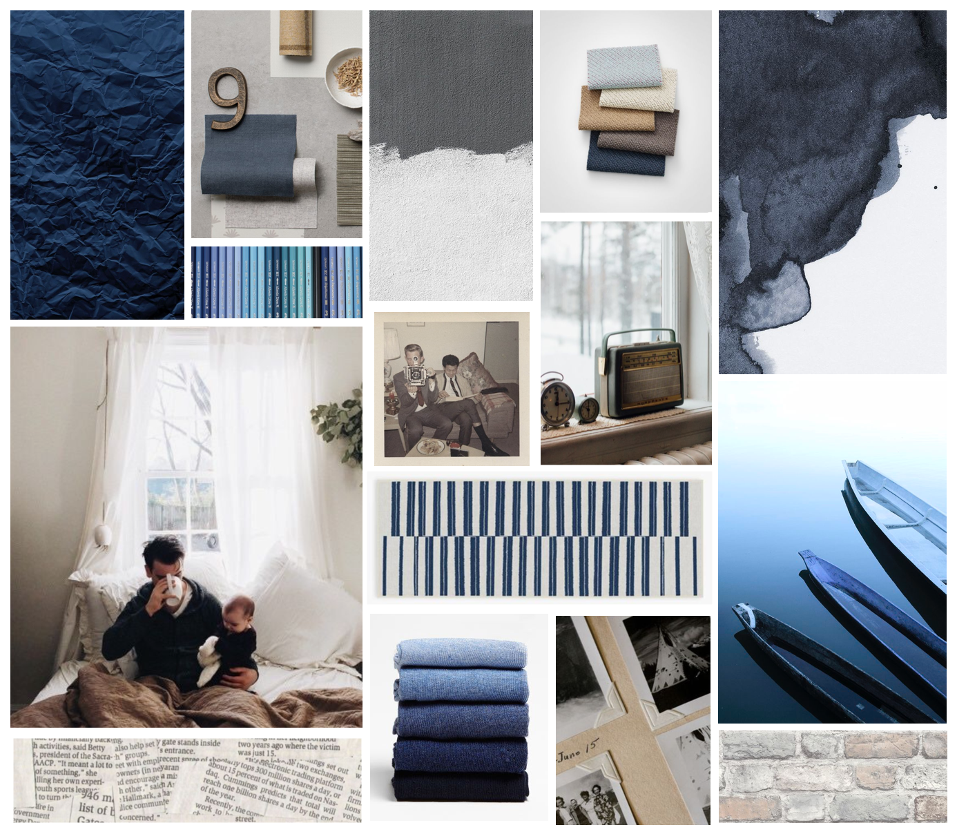
“Human Element”
- * Words users chose: Traditional, Modern, and Familiar
- * "Timely" in terms of style
- * Cohesive scheme and very loyal to Life Snapshot’s ideal.
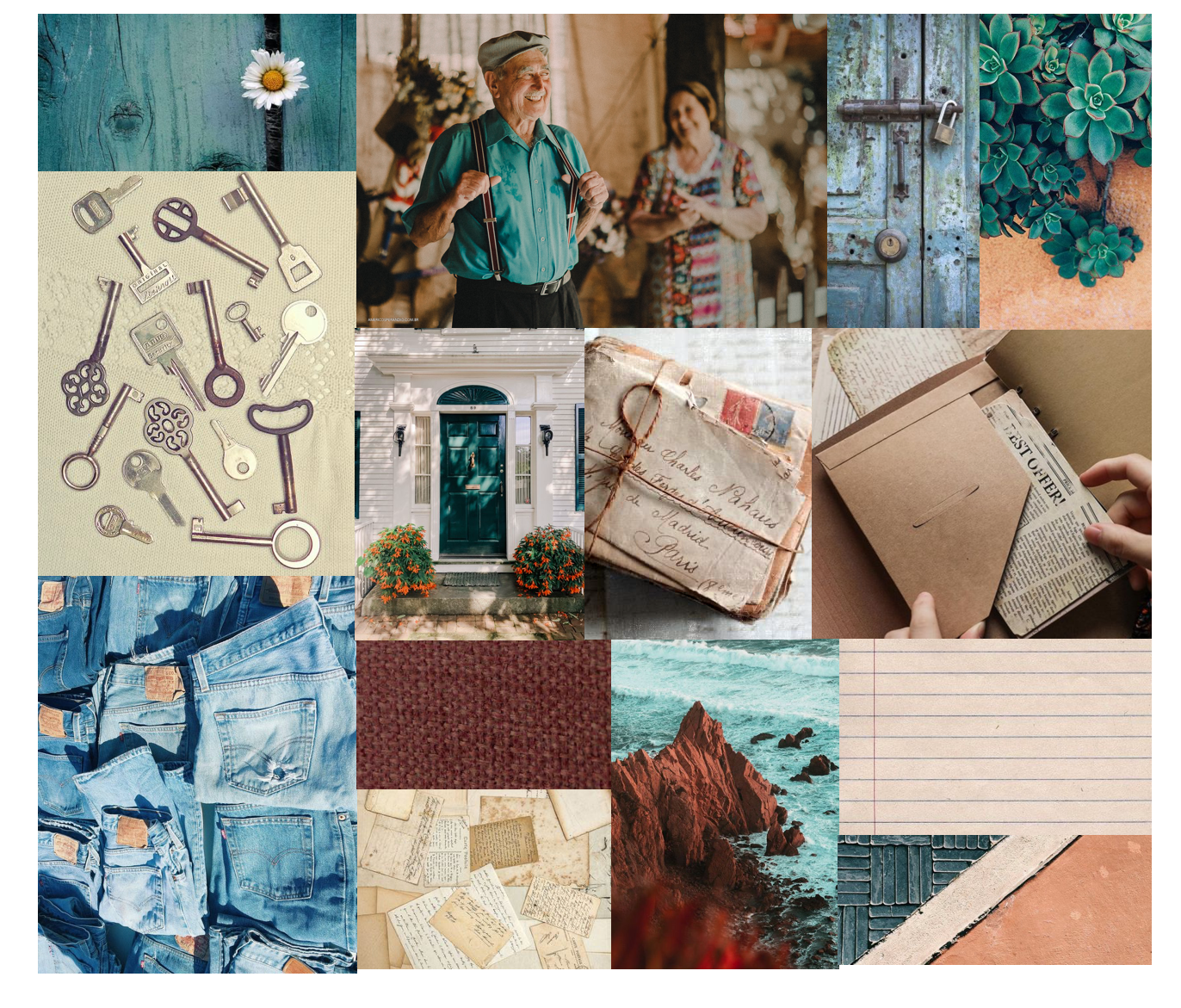
“Life Changes”
- * Words users chose: Busy, Creative, Old
- * Split appeal, some users liked the "journey" thru time, others just had "old" and "shabby" associations.
- * Connects more to estate planning with the documents imagery.
Apply that Feedback...
After some user input, I converted those initial moods to their associated style tiles, a quick impression of the key elements for that mood’s design system. The feedback regarding inclusivity and age was the most influential for me at this stage. The desired brand of the client was something more modern as opposed to old or traditional. And user’s did not desire those negative associations when engaging with this sort of product, which may carry an unpleasant feeling to begin with. At the next client meeting, I received further feedback on this example in particular. Here are the key takeaways;
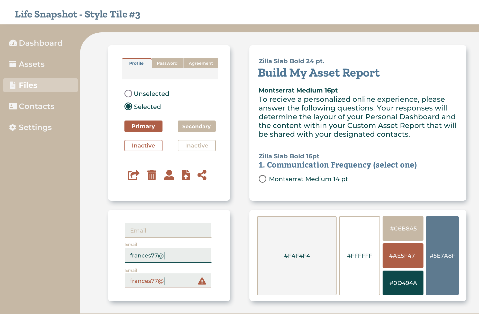
- * The curvature and "friendliness" or the shapes/layout.
- * The connection to documents is a nice touch.
- * The subtlety of the tabs and the highlight on the side navigation.
- * Appreciated the inclusion of icons and their overall style.
- * Not liking the colors, primarily the tan being the main color used.
- * Prefered Futura for fonts (used on one of my other tiles).
As we recognized in the beginning, the functionality issues became a major distraction during our desirability testing half through our project. We needed to address some of these issues, but find a way to fix only a small portion as to not fall out of scope. This became more difficult as we dove deeper into our list of screens. We individually took note of areas of concern in our individual processes and agreed to converge on those ideas for our future recommendations at the final presentation.
Our plan of attack...
We dedicated one of our user tests to usability. Each designer was given a screen to redesign from the desired screens. The intent was to design questions surrounding the usability of the existing site. Then to replicate those same questions but focus them on our new iterations. This was to see what users thought about the “void” brand and compare those findings to that of our current attempts. This was conducted against our first rounds of high fidelity.
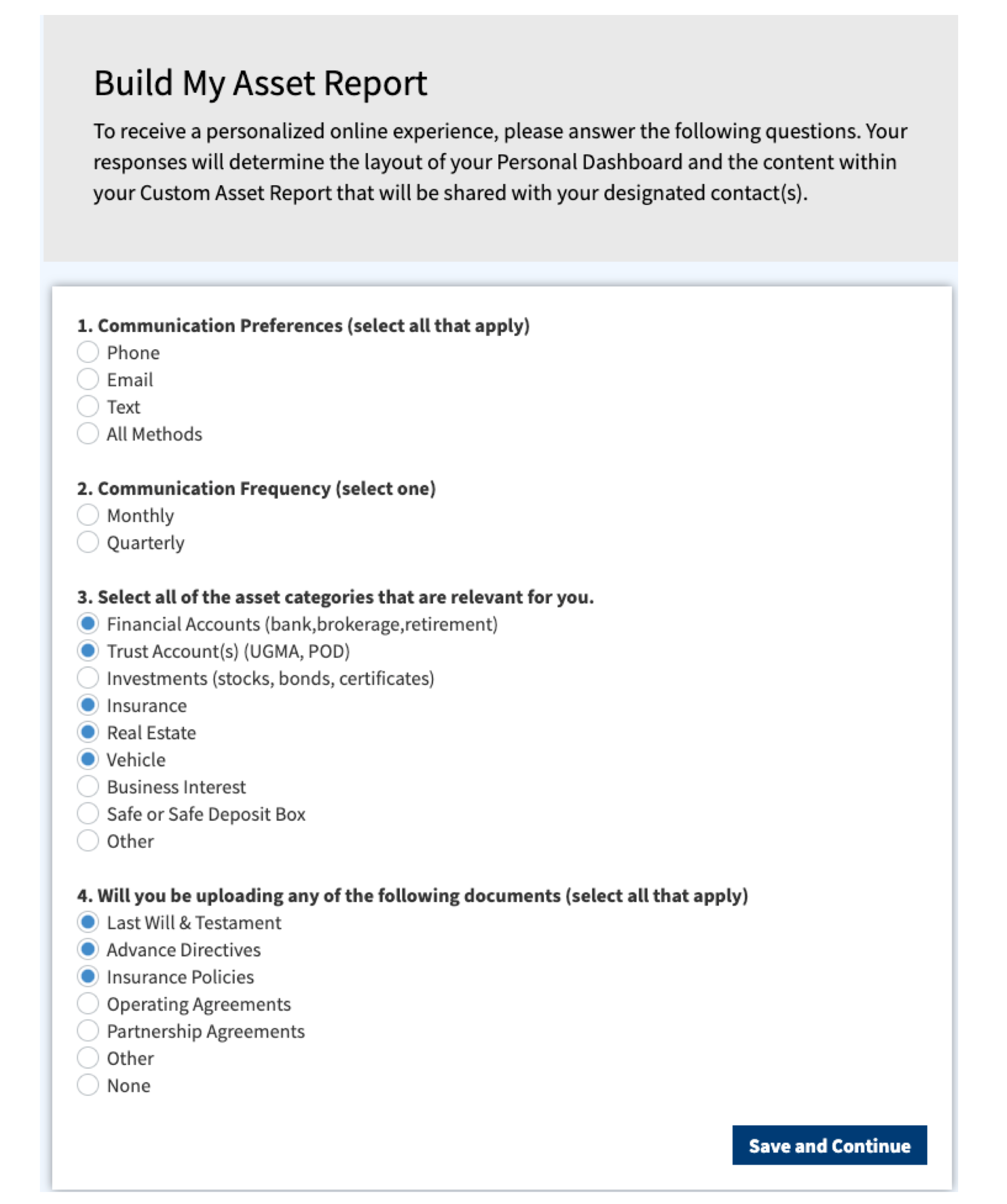
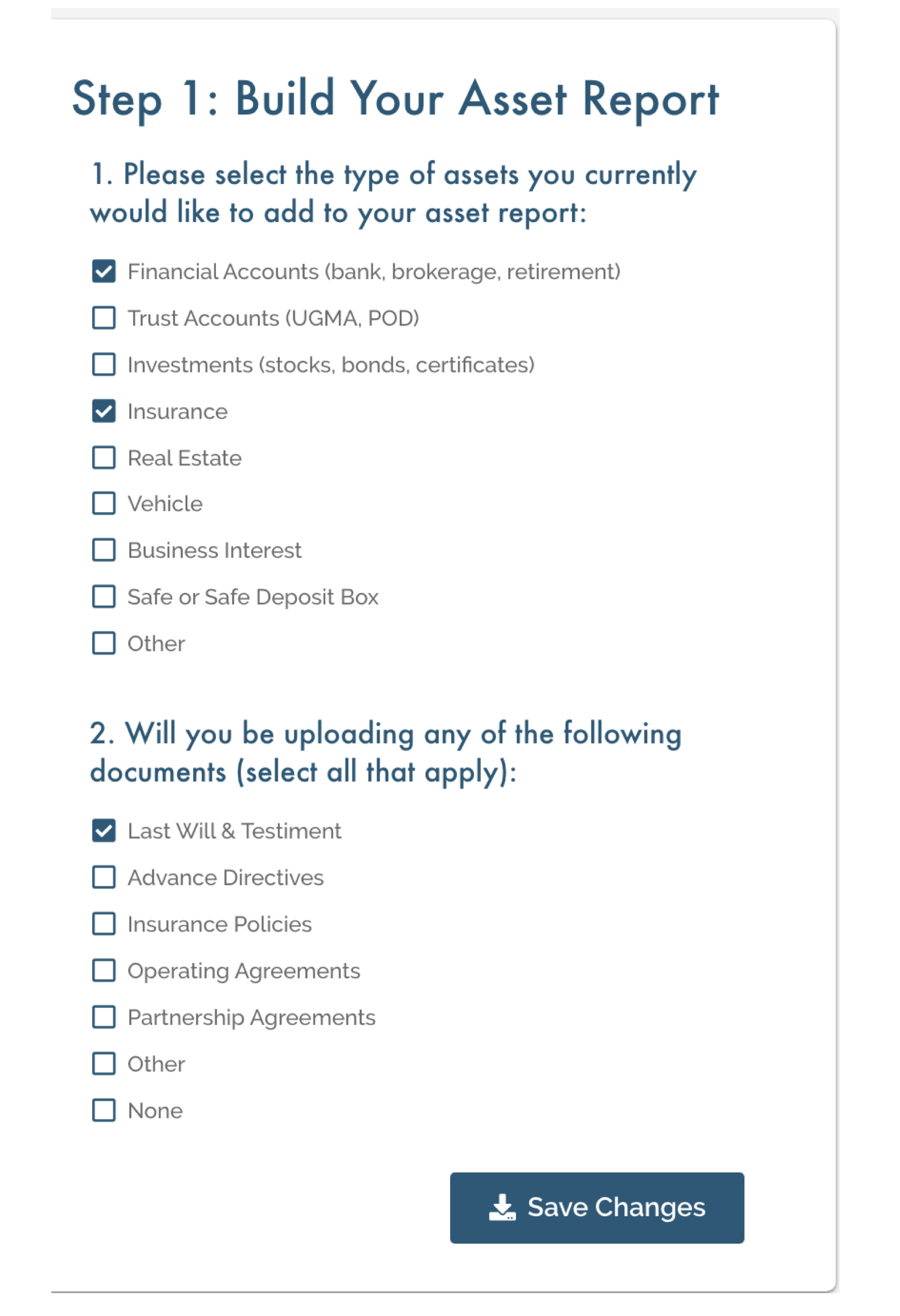
In the examples above, the layout between the two did not change drastically. For my first iteration, I intentionally kept the layout loyal but made drastic variable changes to the instructions within the section. I discovered that by “dressing up” a problematic layout, those functionality issues actually became more apparent to users. This helped solidify our proposal to the client for a better user experience.
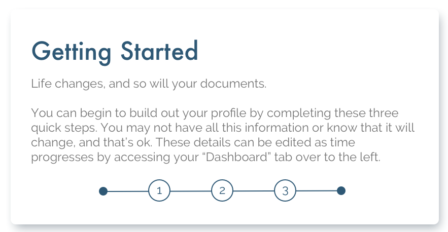
My main variable in this test was the copy. I wanted to test its effect on the brand as a whole and see if this change altered the impressions of the product. Users responded positively to the change, stating this version was more clear and more human than the previous example. The only issue that arose was the amount of text. Some people found it overwhelming for the task. So the change in tone was successful, now the question was "how much text/instruction is too much?"
The final solution...
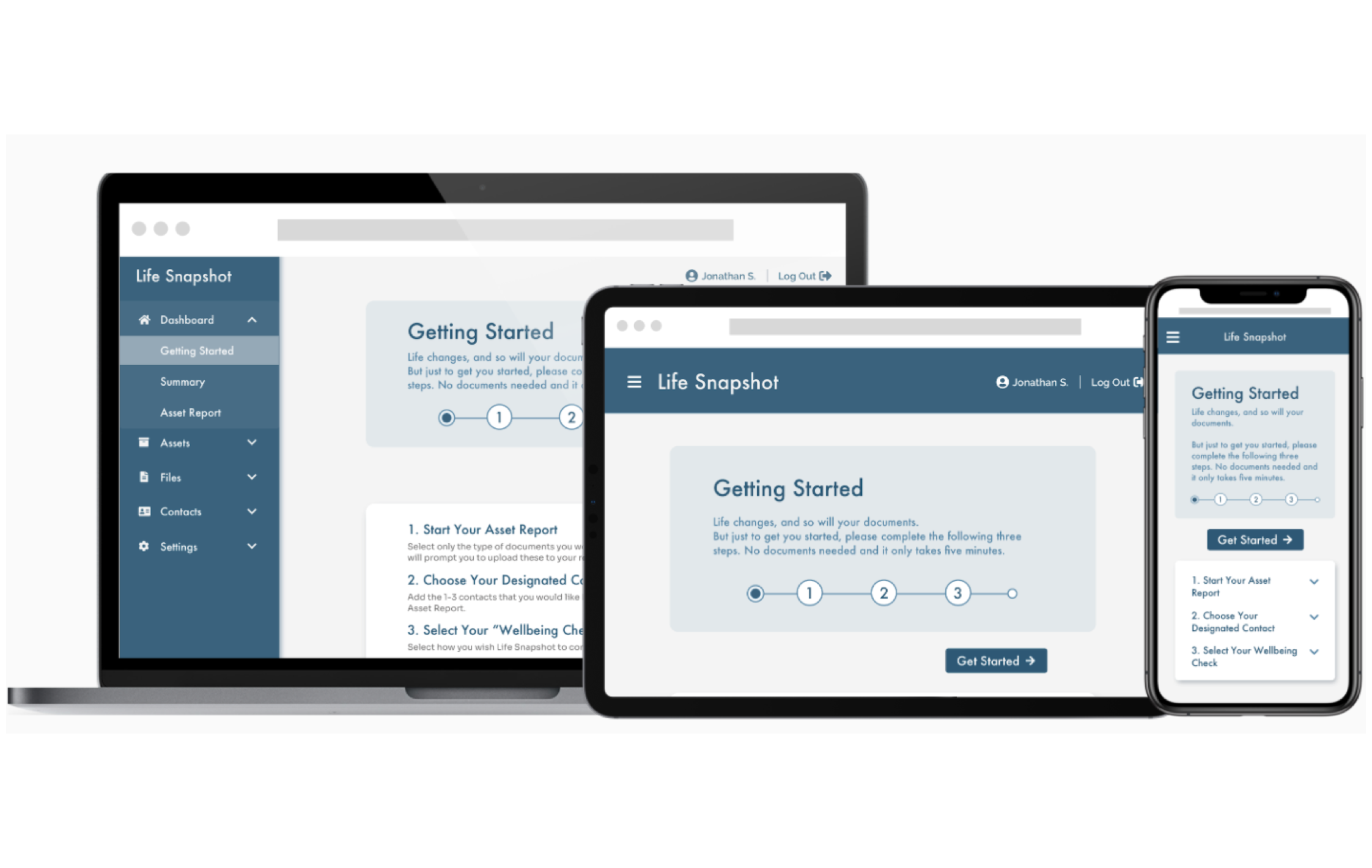
Designing for different devices...
We dedicated one of our user tests to usability. Each designer was given a screen to redesign from the desired screens. The intent was to design questions surrounding the usability of the existing site. Then to replicate those same questions but focus them on our new iterations. This was to see what users thought about the “void” brand and compare those findings to that of our current attempts. This was conducted against our first rounds of high fidelity.
How did I...
Elevate the current brand attributes and values?
- * The goal was to create an overall sense of simple and serious while leaning away from the robotic/financial relations of the marketing site. So a more earthy, muted color scheme was fitting. This meant those secure and professional attributes from the original site remained but were elevated.
- * As for trustworthy, that was all in the functionality. As I adjusted the "getting started" flow from feedback, users began to feel more reassured in the authenticity of the process. The lack of issues made them question the validity less.
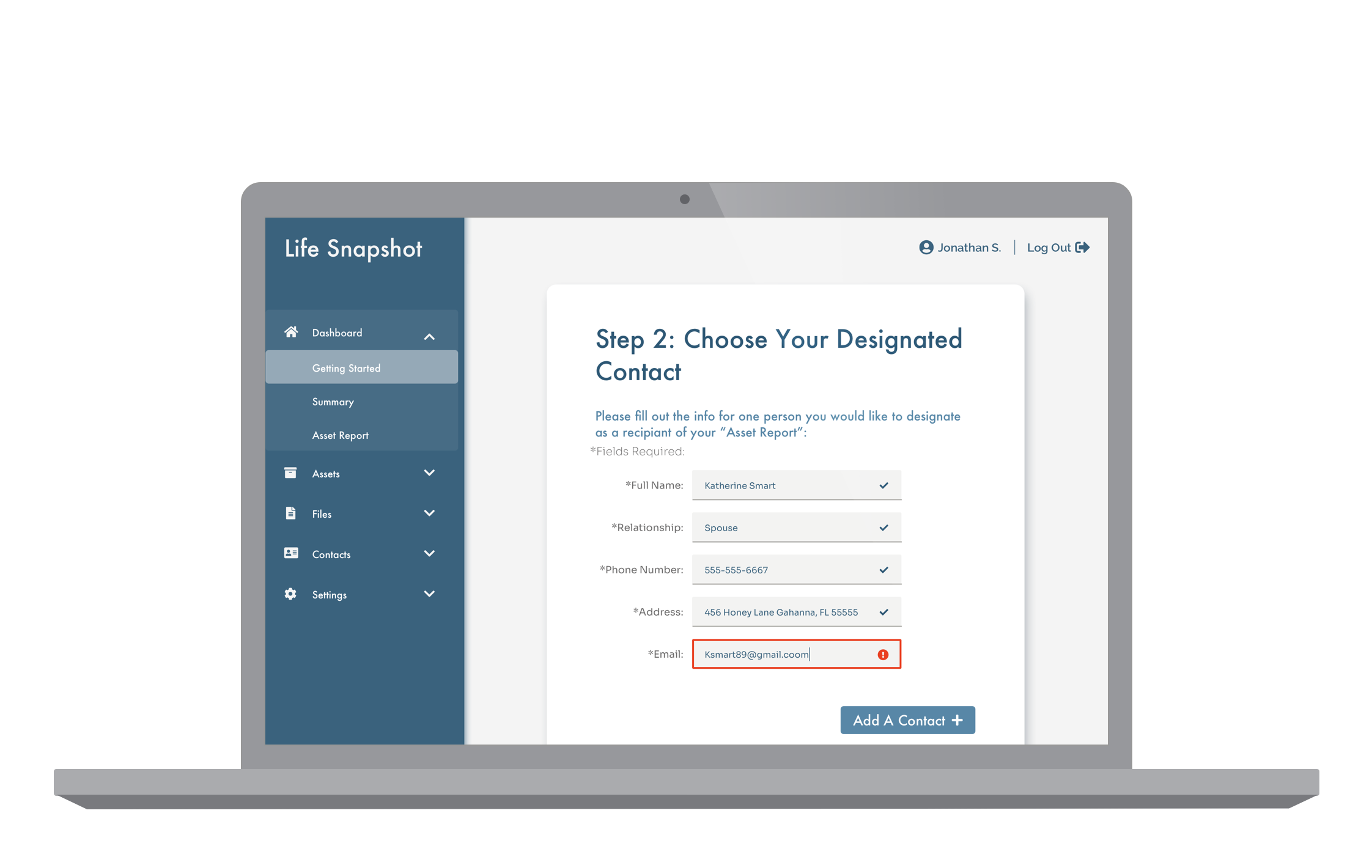
Add that missing human element the client wants?
- * I focused on the tone of the product and the instructions for each section. If the wording and guidance were straightforward and approachable, it would help the overall human connection.
- * Users wanted a bit of transparency for the beginning section, instead of a promise “it would only take five mintures”. They wanted proof. So I added this starting page, giving the user agency to continue forward or simply read what it is they need to prepare for. That agency makes the experience more customizable, and more fitting to the person’s needs.
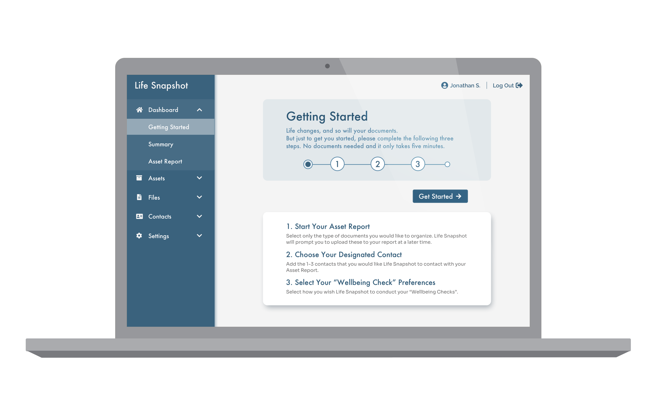
Without getting distracted with major UX changes?
- * As a group, we committed to addressing functionality within the “getting started” section of the application, for it had the largest issues and was the first thing users were exposed to. We individually took note of other areas of concern we noticed in our individual processes and agreed to converge on those ideas for our future recommendations at the final presentation.
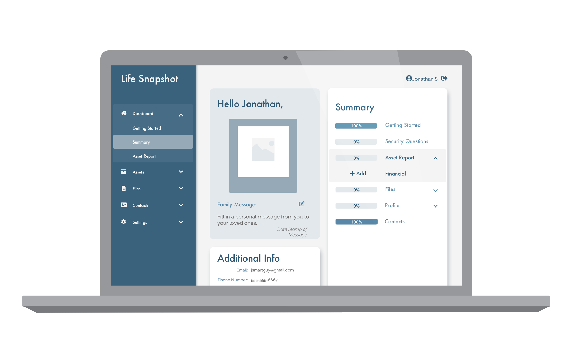
- * As for the other areas of the application, I tried to focus on simple layout changes. Could some of these issues just be solved by rearranging the focus of the user? This proved a fruitful endeavor, especially on the dashboard section. Adding elements and reordering the page provided much-needed clarity.
- * In other areas, reordering was not enough of a fix. The entire process of file sharing for example was very tricky to untangle, as it was used by customers and backend users. This fact applied to most of the site in fact. Some of the functionality was written with the business side in mind, primarily the customer service department, who interact with the users. With two different types of users, we finally understood that this needed further investigation.
Recommendations for implementation...
Due to the time constraints on this project, I was unable to focus on all the areas that I found needed attention. So my team and I compiled a general list of all the steps we would have taken next:
1. More usability testing
As stated during the process, many such frustrations came up in testing users. These functionality issues were sections we wish we would have time to assist in, but due to the tight timeline for the reskin assignment, they were pushed outside of our scope. We targeted a few areas that the client could focus on moving forward, specifically surrounding the dashboard and user’s opinions on the amount of instruction, as our results were inconclusive.
2. Transparency and security design
While researching the marketing site in the early stages of the project, we discovered several references to the security and authenticity of the service. But this was only apparent on the marketing site if someone was adamantly searching for it. I proposed the idea of adding these references and links to the application directly, to the pages where this could be a concern for the user. It would act as a guide to educate the customer on the service policies, or a reassurance that their documents were safely stored on the site.
Footer of the Life Snapshot website.

Statement on the services page of Life Snapshot.
3. Cohesive Copy
I attempted to change the tone of the application to that of a helpful teacher, someone who is instructive but not too familiar. This approach was welcomed by users for this type of process and they also felt it did not diminish the professionalism of the brand. Since these changes were hailed with such an encouraging response from user and client alike, I encouraged them to apply this formula across their brand along with the design system, something they may not have thought to do based on our brief requirements.
Finalizing the design system...
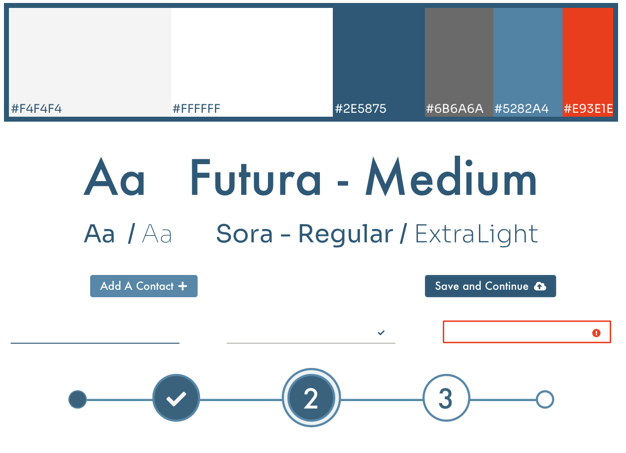
User’s had only one consistent critique about my submission; the text was hard to read. To be precise, it wasn’t the typography they had a problem with. I chose a very straight font originally, for a more professional appearance. That particular font at the standard weight is very light and the number styling turned out to be rather distracting with it’s positioning. So the largest change I made was to the body font overall.
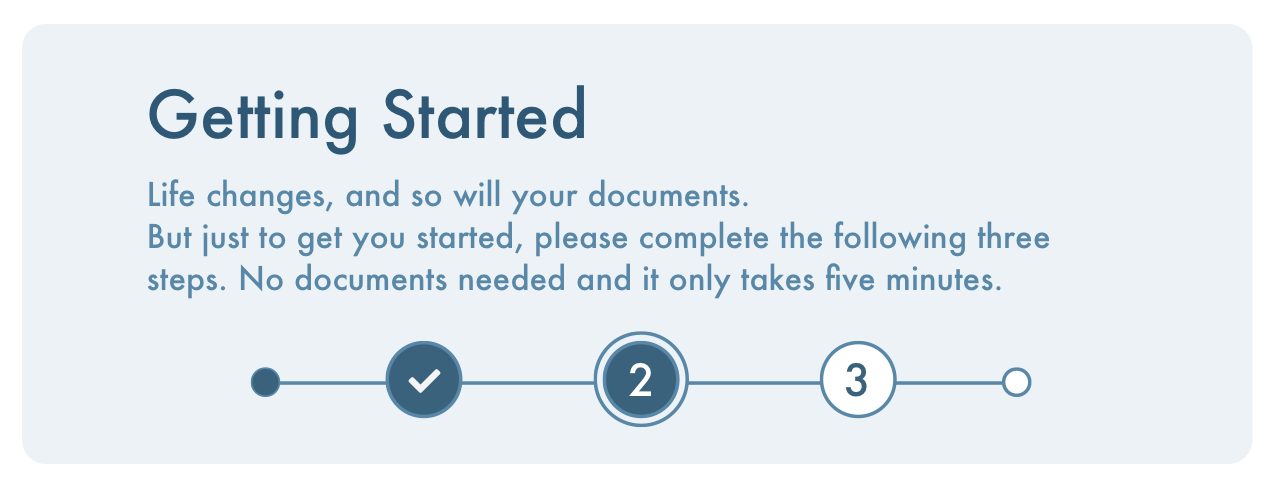
All that remained to finalize was the assets and symbols, specifically, the progress bar for the getting started section, and clarifying the grid for the programmers to utilize. Also cleaning up my sketch file, as that was a requested handoff item from the client.
The client's response...
“Thanks for your hard work on this, it really shows.”
The overall response to my designs was very positive. That quote is a line sent to me after our final handoff when the client reached out for some clarifying details and a few past iterations I had shown in previous meetings.
They had decided to go forward with my design system as a foundation for their brand. That notion only makes me more grateful for the opportunity to enhance this product, and more proud of the final results I was able to create.
Life Snapshot was overall a challenge for remaining in scope while utilizing all aspects of design to elevate the brand. From the copy to the layout of a page, I was able to solidify the process of the application and its purpose for the user. A designer can reskin a brand in more ways than just simply “putting lipstick on it”.