Events App UI (Student Project)
The task ahead...
Vente was a project handed to us UI designers from a previous UX team. Our stakeholders noticed a demand for an events app, but one, unlike anything, already existing. The events marketplace is oversaturated with apps that claim they have “everything”, but there was an opportunity to tune “everything” to the user’s specific needs.
“Users need a way to stay up-to-date with the local scene, but have difficulty finding personalized events that keep their interest.„
Meet Nate, the "Event Junkie"
- * Urbanite
- * Young Professional - Writer
- * Wants to stay current with the local scene
- * Wishes for the scoop on local classes, events, and meetups.
- * Frustration: Too much is happening at once.
Nate's wants were actually perplexing. From the outside, it seemed that competitors in this space were already providing this organized and personal experience. But in actuality, they were providing a trove of options, and it was overwhelming users. People like Nate with busy work lives needed something quick to reference, not another catalog to search through.
So, how Do I...
Ensure a complete up-to-date search experience?
Make events more personalized?
Not overwhelm our user with the information?
Studying a saturated marketplace...
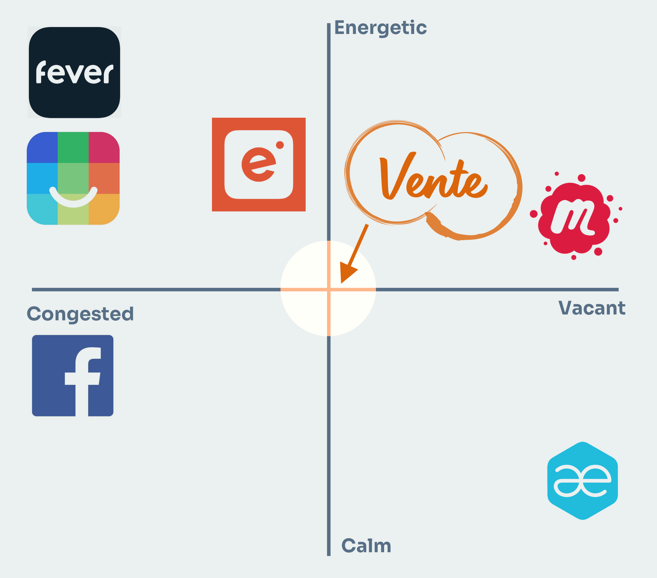
The events space is full of promising apps that are all competing to be the end-all destination for booking and planning events. But, events is such a broad topic. There was an opportunity here for a product that tuned in to the user’s channels and network and curated all types of events, from friends’ birthday parties to concerts downtown. An app that didn’t overwhelm with options, but assisted in the search.
First, brainstorm some principles...
I began identifying the brand by establishing some keywords that I wanted Vente to emulate. This was a stream-of-consciousness exercise for about 5-10 minutes at the start of my project. I started with some of the words I kept repeating during the research process, ____ and ____ being a few. I kept writing the next word that came to mind after these, and it trickled down from there. Later in my process, I was able to return to these words, and refine them into actual design principles.
Breathable
Not enveloping. A light interface that is welcoming and approachable.
Clean
Consistant and minimal use of type, color, and iconography. A crisp experience.
Organized
Structure and tight grided system. Easy to understand navigation and search.
Next, sketch out the identity
I grouped words that were similar and tried to doodle emblems to resemble them, not spending more than a minute on a doodle. The idea was to be quick and divergent at this stage, so cleanliness and consistency were not the main priority. This lead to some repeating themes that helped to narrow my decision making for the next step.
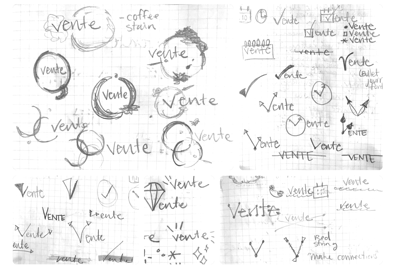
Preliminary sketches for Vente's logo design.
I then took a few strong iterations to a digital platform and tried to diverge even more. Also, I wanted to reanalyze my creations. My intent was to have everything about the logo speak to the brand at large; no unnecessary embellishments that didn’t enhance the theme. Every minor decision needed to be backed with purpose.
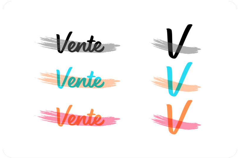
An example of digital sketches for the inked/marker motif.
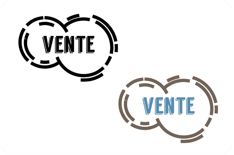
An example of digital sketches for the coffee stain motif.
Finally, we have a brand...
After some meticulous editing, I finally had a logo for Vente. The coffee stains started out as a misassociation (with the venti size at Starbucks) but evolved into a happy little accident. Coffee rings, or maybe even wine glass rings, are the result of people gathering and connecting with each other. The sharpie handwriting can resemble your name on a to-go cup, or a handwritten note in your personal calendar. The enveloping theme of Vente is to collect and gather with others, to know everything that is happening around you. And so the circles as a shape elevate that core idea.
Capturing an atmosphere...
I gathered a number of photos of events and outings someone like Nate could participate in. They ranged from food truck festivals to nightclub outings to bonfires on the beach. I then tried to focus those “atmospheres” into overall moods.
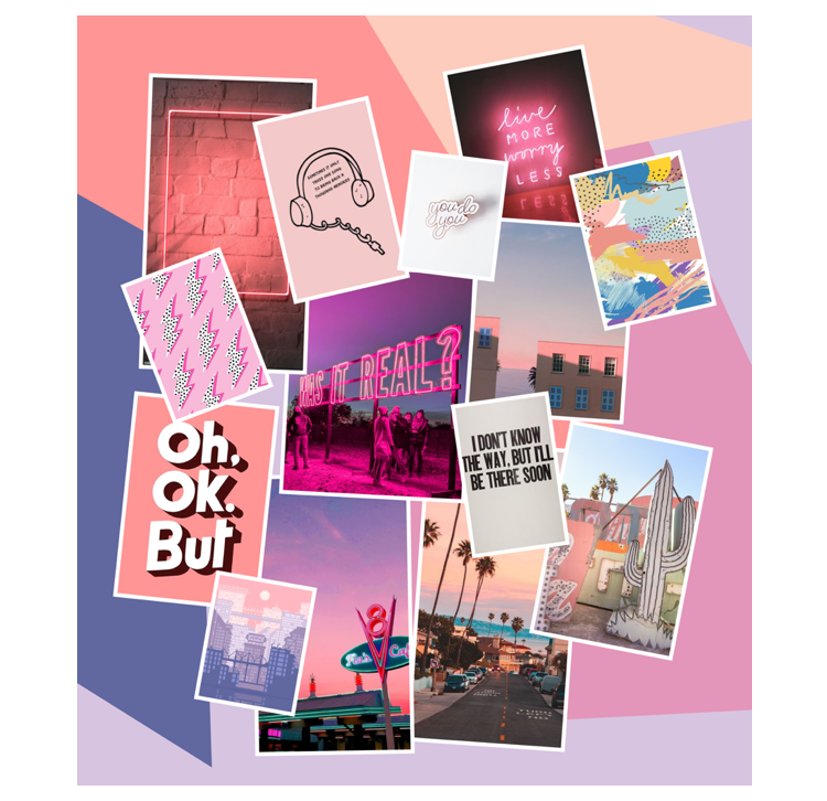
“L.A. Sunset”
- * Goal: To experiment with the lively and energetic motifs within the current market, but in a more universal way. The enveloping light at sunset.
- * Feedback was mixed. Some stated it may be “too feminine”, but I interpreted that as bias.
- * The warmth and light motifs were desirable to viewers.
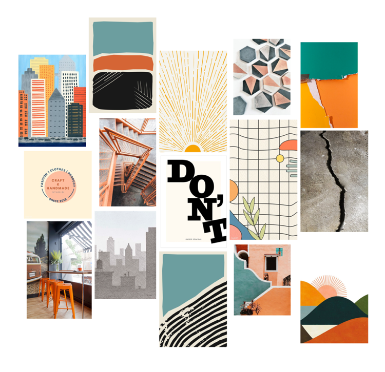
“Breath of Fresh Air”
- * Goal: Based around brick and mortar hipster shops on could frequent. More textures and handwritten effects. Elements one could be exposed to on a daily basis in an urban landscape.
- * Viewers felt something about sketched lines and inked impressions.
- * The stark lines and layout were also enticing.
- * The colors were pleasing but too inconsistent for some
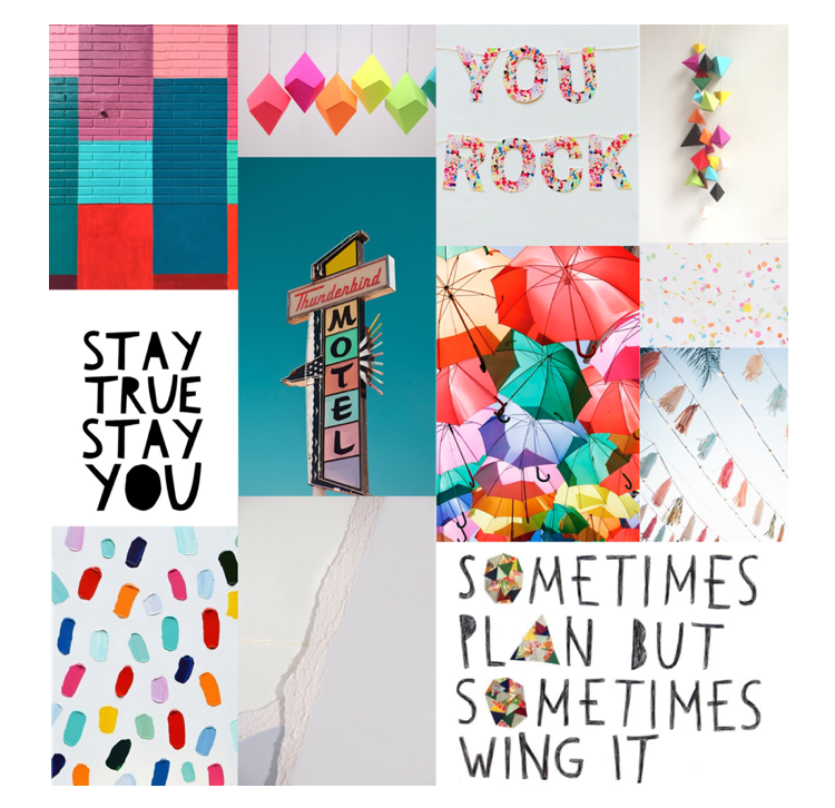
“Reflective”
- * Goal: A bright Saturday afternoon outdoors, at an amusement park or festival. The clear sky and surrounding vibrancy of color everywhere.
- * Some connections with “youth” but leaning more towards "juvenile".
- * Too much color and not enough whitespace, in composition or the images.
Refining a theme...
This was one of many style tiles I diverged upon, but this particular one proved to be my foundation moving into high fidelity. I jumped off the appeal viewers had with the “urban grid”, specifically the sketched lines and everyday items one could interact with. The goal was to appeal to the professional side of Nate and his writing career in all elements. And everyone knows the feeling of paper and leaving an impression or mark. The structure of a grid and neutral palette were to complement that paper aesthetic.
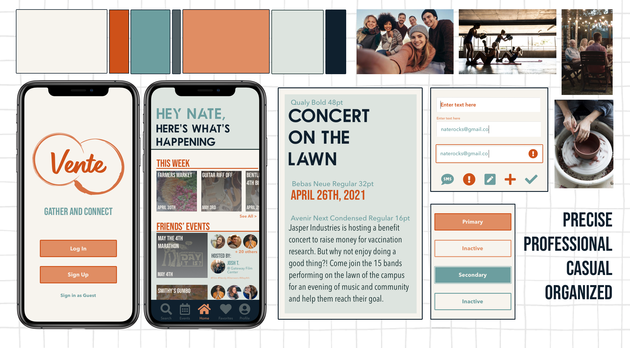
- * The paper representation was very well received. Connecting digital and realistic spaces. Another connection for the brand.
- * The muted tones are still vibrant enough to be exciting, but mellow enough to bring a calmness.
- * The photo treatments with the low saturation fit nicely with this theme.
- * The typography leans into the "mechanical". The stenciled look, while comprehensible, isn’t connecting.
- * The navigation creates a disjoint for the composition of the app.
How did I...
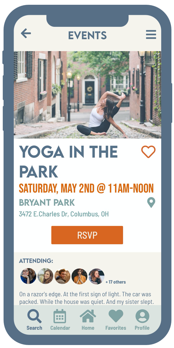
Ensure a complete up-to-date search experience?
- * A focus on the time and date of an event; Bright orange takes the focus of the user.
- * Consistency of that hierarchy throughout the app. Follows the same rules for thumbnails and grids as it does on the landing pages.
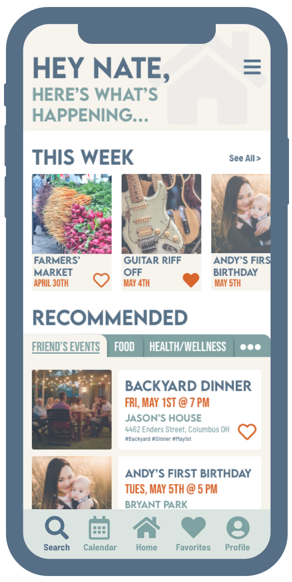
- * "This week" category; curated by the app, not the user. Vente populates suggestions based on the current date and what's upcoming.
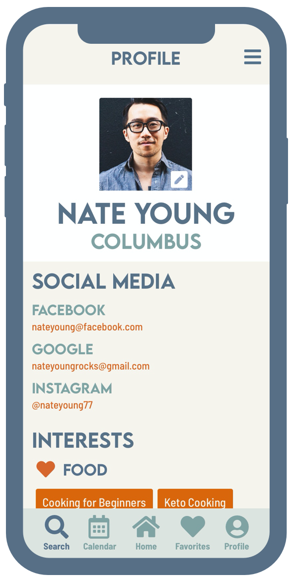
Make events more personalized?
- * Interests, at the beginning of the user journey and accessible in the profile section.
- * Friends in attendance for events, connecting to social networks and calendars.
- * Favorites options for events. Users later suggested functionally the hearts should work like "saves" instead of "following". Too confusing because of sites like Instagram.
Not overwhelm our user with the information?
- * Broken up grids, both vertical and horizontal to help the eye navigate the separated spaces.
- * Tabs with clean headings for the sections. Not an endless scroll.
- * The hierarchy with the colors is intentional. The muted colors of text sit further back on the screen while the more vibrant and larger words take center stage. This gives the eye room to relax.
Feedback from users...
For this project, we only had one round of user testing. The test was a true hybrid, focusing on both usability and desirability. Participants were asked to go through two flows as shown by the prototype above; A first-time user sign up flow and choosing an activity in the health/wellness section of the app. Some key takeaways are:
Areas of Success
- * CTA's are directing action, but not overpowering or overwhelming.
- * The theme as a whole has high appeal.
- * Words used to describe it; "Neutral, Soft, Inviting".
Areas to Adjust
- * Inactive states are not as clear as intended.
- * Some word and intent discrepancies like "following" vs. "favorites".
- * Minor layout adjustments to grids
A responsive marketing site...
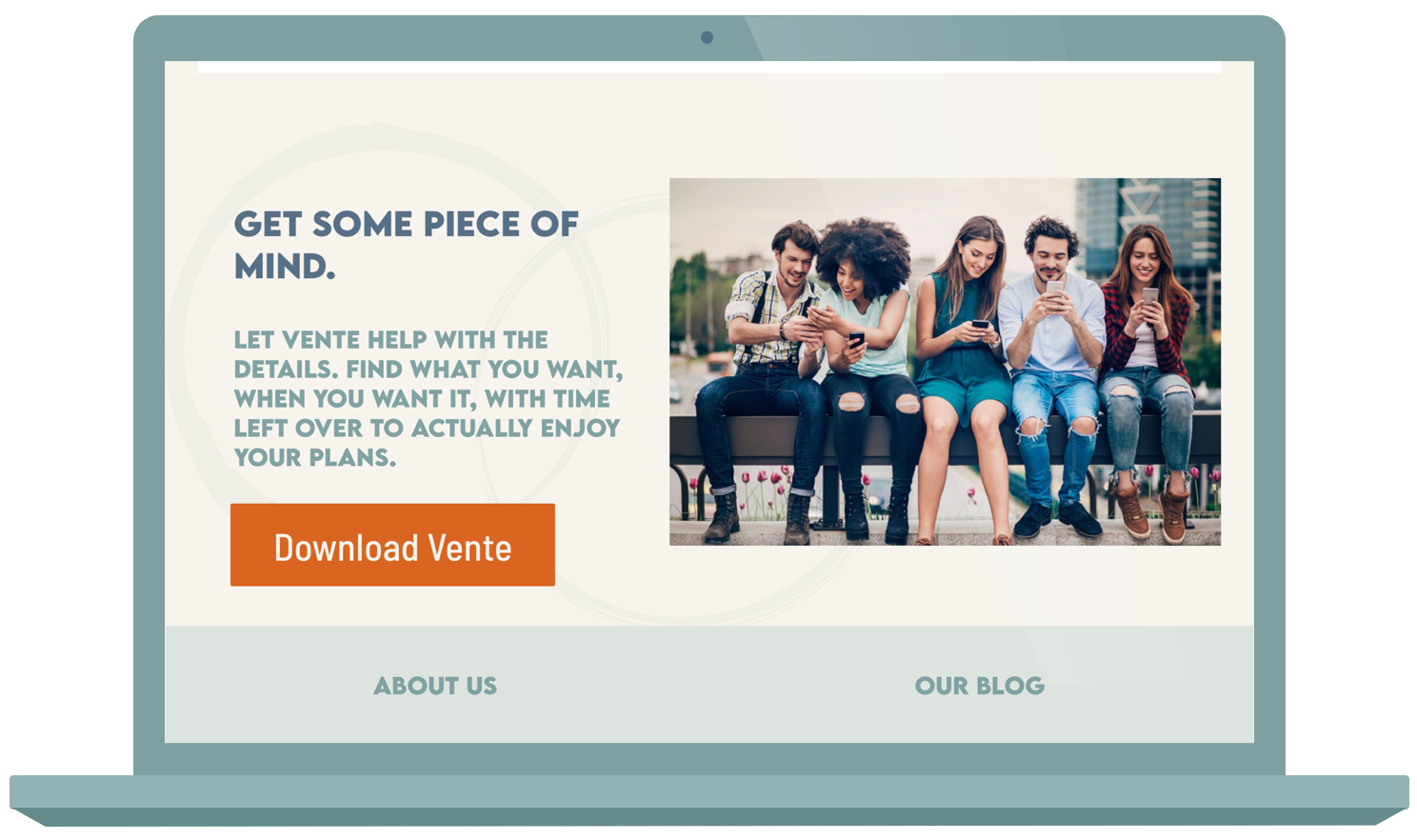
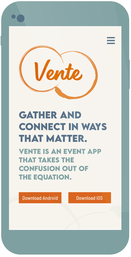
The brief also required a responsive marketing site in order to represent Vente overall. This project is very brand heavy, so the composition of the site needed to follow the same guidelines as the style guide I was building for the mobile app as well. For this site, I focused on the communal aspects of the brand, people connecting and gathering, since that was not a direct showcase on the app itself.
Creating this styleguide...
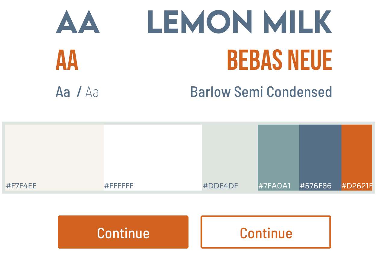
Translating to the style guide was a very streamlined experience since I applied many internal rules to follow my “organized” principle. However, I created the style guide by hand, as if it were a printable document. Later I was introduced to the software “Zeplin” which would have made the experience silky smooth. This realization was something I began to study for my next project. Another tool for my arsenal.
Overall, Vente proved to be a large task to undertake alone. From branding to high fidelity, this brief was very detail-oriented and large in scope looking back on it now. But after presenting this before my instructors and peers, I had (and still have) an immense amount of pride attached to this project. It was a steep learning curve, but the end results were very satisfying.
Gather and Connect